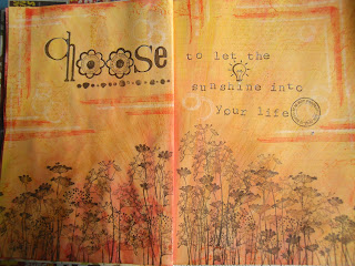
I promised myself this year I would experiment with more colour in my journals, especially colours I don't like, and here are the first two pages made during Snazzys AJ Sundays at the end of May & June.
Back in the dark ages, when I was a girl, I was very pale skinned with very blonde hair and my Mother used to dress me in red to 'cheer' me up. Problem was add a bit of heat, or a bit of sun, or a bit of cold, or a bit of exercise never mind embarrassment and my skin could exhibit every shade of red going lol!
Consequently, I loathe red, never wear it, rarely work with it, don't own anything red. What better colour to start with - once I had been shopping.
Postbox Red Dylusion's Ink Spray, Ranger's Distress Inks in Barn Door, Fired Brick & Festive Berries plus Tsukineko's Versafine in Crimson Red & Satin Red all found their way to my studio and onto this page - I did buy some Cherry Pie Ink Spray too as it looked pretty red on the label but on an empty white journal page it looked pink ;o(
I was in need of sunglasses to cope with all the colour so added some Gessso stamping with Kaisercraft Background stamps, texture paste through a couple of Prima Stencils, Chequerboard & Crackle, (which turned red as I hadn't dried the Ink Spray, interesting effect tho') and Tissue Tape inked with some Vintage Photo Distress Ink to try and tone it down a bit - that went well then lol!
I think I quite like the page but I still loathe red!
The following month it took me all of two seconds to come up with a colour I dislike almost as much as red. That would be orange then, very closely followed by yellow - haven't worked out what it's for other than when a circle of it appears in the sky from time to time.
Set me thinking...
Dylusions Ink Sprays in Lemon Zest, Pure Sunshine and a touch of Sqeezed Orange with Scattered Straw & Mustard Seed Distress Inks, topped with Wild Honey Distress Paint scraped on thinly and it was certainly orange, extremely orange. I added some of last month's red Distress Inks to try and warm it up (I am becoming my Mother!) then consoled myself the beautiful Donna Downey stamps from Unity, I had finally treated myself to would hide most of the sins.
I then covered everything with a couple of thin coats of Gesso to create a sort of sunray effect and to try and calm things down, then stamped Hero Arts new Stamp your Story stamps in Archival Ink in Saffron, Distress Ink in Ripe Persimmon and Picket Fence Distress Paint. I then added the flowers and words with stamps from PSX (there's a blast from the past!) and MM in my favourite Versafine Onyx Black ink.
I like this page marginally better than the red one but am so grateful I told myself I need only use each colour once in my journal, what a relief!
Thanks for persevering with my inky exploits.
Back soon xx


Well I like BOTH pages!
ReplyDeleteKathyk
Brave colour experiments - and great results, I'd say - especially the sunshiny one. I got part way through some pages not unlike that - in colour at least - but got stuck (since I'm also not much for the orange/red end of the spectrum), but this is great inspiration to head back and take another look - thank you.
ReplyDeleteAlison x