Showing posts with label Versafine. Show all posts

Tuesday, 10 November 2015

Leftovers

Well, long time, long time and all that. I have just checked and it is almost 12 months since I last posted anything on this blog. It was always intended as a place to record projects I made just because.... clearly there has not been a lot of that going on in my studio! So, time to make some changes, and here is a journal page I made in my A4 journal simply because I had a leftover photo and some lettering from the title of a 12x12 layout I had been working on for a workshop.

The background was created with lots of very thin layers of Distress Paint in Wild Honey, Spiced Marmalade, Barn Door, Fired Brick, Seedless Preserves and Black Soot scraped on with an old plastic room key. Once the paint was dry the colours were a little too bright for me so I used a baby wipe to work in some Black Soot paint, wiping almost all of it away dulled the colours but still allowed them to show through. I then used BoBunny The Written Word stamp set to add random patches of stamping in Onyx Black Versafine with black texture paste through Tim Holtz Stripes Layering Stencil. A few lines stamped with the edge of the plastic card with Antique Bronze Distress Paint and a few splatters of the same, watered down a little, and it was time to add some Sizzix Die cuts, also Tim Holtz, and highlighted all the texture with Treasure Gold in Rose Quartz.

The letters were leftovers from a layout title I had die cut so I simply glued them to a couple of leftover strips of black cardstock.

I had only allowed myself an hour to play and I was quite pleased with the end result. I am going to try really hard to make an hour every week to make something, anything, just because.....

I hope you will join me x


Sunday, 7 December 2014

Art Journaling Sunday

Hello everyone, thanks for dropping by especially since I have been absent for far too long.

Mostly I have been busy with workshop projects and just can't seem to find the time to craft just for my own pleasure. I do plan to be around in blog land much more regularly in future, with lots more step by steps and videos too.

Meantime....on the first Sunday of each month there is an Art Journaling session in Snazzys Studio between 11am and 3pm. There is no need to book your space, just drop in and join us. All you need is to want to have a go, bring your own journal if you have one, but if not we can provide everything you need for just £5 for the session, and that includes your tea/coffee and biscuits.

Being December, and with Christmas fast approaching, this month I wanted to create a rich page with a touch of metallic. I have been admiring the beautiful backgrounds using Brushos being shared in blog land, but with a studio full to bursting I really can't justify investing in them. So, having applied a layer of gesso to the blank page with Cut and Dry foam, I thought I would experiment by adding a few sprinkles of Polished Pigments/Primary Elements from Luminarte, whilst the gesso was still damp. I then immediately lightly spritzed the powders with water until they were wet enough to blend together, tilting my journal to get them to run a bit.

I was really pleased with the effect and the photo certainly doesn't do justice to the richness of the colours or the shimmer!

As often happens, I then got so carried away with some of my favourite Hero Arts stamps, Ranger Embossing Powders in Copper and Gold and Versafine inks in Crimson Red and Olympia Green, I forgot to take photos of all the steps but I think it is pretty self explanatory.

The only downside I found using the Luminarte powders in this way was they acted a little too effectively as an anti static powder and so made it quite tricky to get the inks to stamp cleanly and the embossing powders to stick evenly. I didn't really mind as the Hero Arts stamps were a little too modern for the vintage effect I was looking for, so I think the problems I had actually helped me get the look I wanted. Serendipity in action again lol!

This was the last AJ session for 2014 but the first of the new year will be on Sunday 4 January when I am looking forward to starting a brand new journal using an old book as my base. Many thanks to all of you who have dropped in to journal in 2014, new journal or old, beginner or regular, journal or old book, I do hope to see you in the studio in 2015.

Have a very Happy Christmas and good fortune to you and yours in 2015 xx


Monday, 1 July 2013

Colourful Pages

Yes, really!

I promised myself this year I would experiment with more colour in my journals, especially colours I don't like, and here are the first two pages made during Snazzys AJ Sundays at the end of May & June.

 
Back in the dark ages, when I was a girl, I was very pale skinned with very blonde hair and my Mother used to dress me in red to 'cheer' me up.  Problem was add a bit of heat, or a bit of sun, or a bit of cold, or a bit of exercise never mind embarrassment and my skin could exhibit every shade of red going lol! 
 
Consequently, I loathe red, never wear it, rarely work with it, don't own anything red. What better colour to start with - once I had been shopping.
 
Postbox Red Dylusion's Ink Spray, Ranger's Distress Inks in Barn Door, Fired Brick & Festive Berries plus Tsukineko's Versafine in Crimson Red & Satin Red all found their way to my studio and onto this page - I did buy some Cherry Pie Ink Spray too as it looked pretty red on the label but on an empty white journal page it looked pink ;o( 
 
I was in need of sunglasses to cope with all the colour so added some Gessso stamping with Kaisercraft Background stamps, texture paste through a couple of Prima Stencils, Chequerboard & Crackle, (which turned red as I hadn't dried the Ink Spray, interesting effect tho') and Tissue Tape inked with some Vintage Photo Distress Ink to try and tone it down a bit - that went well then lol!
 
I think I quite like the page but I still loathe red!
 
The following month it took me all of two seconds to come up with a colour I dislike almost as much as red. That would be orange then, very closely followed by yellow - haven't worked out what it's for other than when a circle of it appears in the sky from time to time.
 
Set me thinking...
 
 
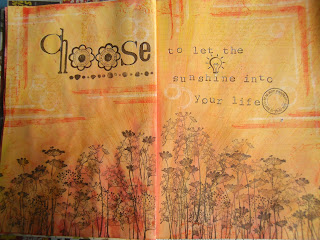
Dylusions Ink Sprays in Lemon Zest, Pure Sunshine and a touch of Sqeezed Orange with Scattered Straw & Mustard Seed Distress Inks, topped with Wild Honey Distress Paint scraped on thinly and it was certainly orange, extremely orange. I added some of last month's red Distress Inks to try and warm it up (I am becoming my Mother!) then consoled myself the beautiful Donna Downey stamps from Unity, I had finally treated myself to would hide most of the sins.
 
I then covered everything with a couple of thin coats of Gesso to create a sort of sunray effect and to try and calm things down, then stamped Hero Arts new Stamp your Story stamps in Archival Ink in Saffron, Distress Ink in Ripe Persimmon and Picket Fence Distress Paint. I then added the flowers and words with stamps from PSX (there's a blast from the past!) and MM in my favourite Versafine Onyx Black ink.
 
I like this page marginally better than the red one but am so grateful I told myself I need only use each colour once in my journal, what a relief!
 
Thanks for persevering with my inky exploits.
Back soon xx
 

Saturday, 23 March 2013

Experiments in colour......

Hello there.
 
Those of you who know me well will recognise my addictions below - stamps (of course), black ink (preferably Tsukineko's Versafine in Onyx Black), backgrounds, 'nothing' stamps (not stamps of nothing that would be really silly, but stamps that are not of something in particular therefore versatile), really nice smooth white paper (ideal for stamping on), really fine detailed stamps, layers, alphabet/word stamps, very little colour and certainly no strong colours - other than black & white. 
You're getting the theme now lol!  
 
 
Even when I journal or scrapbook I find myself needing stamps, can't doodle, never hand write, never draw - can't, it's why I stamp, never use strong colours - other than black & white!
 
 The page above is very typical of the sort of journal page I enjoy creating, even though it does include some of my very messy handwriting.
 
Now, nothing wrong with creating things just because you enjoy the process, it's called a hobby! It's started me thinking though about why I find myself in the same groove. I have very little time to create so it's easy to reach for the 'go to' products because I know they will work for me, I will relax and be mostly pleased with what I make = good use of scarce time.
But is it the best use of my time?
 
Which brings me to........
 
 
my newest journal which I have decided will be all about my experiments in colour. I am going to make a real effort to use colour, especially those shades I am not so keen on, and hopefully learn something about the best use of my time along the way. Results to follow.....
 
What are your 'go to' products? what would you experiment with?
 
Do tell xx


Thursday, 28 February 2013

Hearty Greetings

Hello there.

It's been a long time, but then it is rather a long time since I made anything just because I fancied making it.

This little heart was just a quick Valentinesy piece which started as an experiment to see what happens if you use Ranger's Distress Crackle Paint in Picket Fence on white Sticky Back Canvas.

 
Well, it gave me a very fine crazed, rather than crackled effect, which I loved but it was very subtle, possibly magnifying glass territory lol! So I added a spritz of Dylusions Vibrant Turquoise ink spray, which leeched beautifully into every little crackle, and then added my Stampotique Falling Hearts stamp in Versafine Deep Lagoon.
 
I really liked my canvas heart so had to make a little something to add it to. So, one Wendy Vecchi Art Parts heart and word, smothered in Lake acrylic paint from Eco Green Crafts with some of their Artists Spackle through a Dylusions Harlequin stencil, plus Viva's Inca Gold in silver to highlight the texture. But, still lacking something, I swiped a corrugated metal set of wings with the Lake paint, on a baby wipe as I had alrady washed my brush, some more silver highlights and I was done.


Not a bad little project for less thn 45 minutes play.
 
Back soon xx
 
PS I added the little heart brad to balance the word 'Love' as it could only go just there after I discovered that if you put your finger on the crackle paint before it is dry it just lifts straight off.
You have been warned lol!! 


Tuesday, 19 June 2012

Dylusions & Pan Pastels


Last Saturday the afternoon workshop I taught at Snazzys was all about Pan Pastels. I was trying to illustrate my belief that their versatility means just having a few colours of the pastels need not limit what you can create, but actually allows you to really explore all the techniques you can use with them.


This was the final project of the afternoon using Bright Yellow Green and Pthalo Green Pan Pastels, Tsukineko Versamark and Versafine Onyx Black inkpads plus some of my favourite masks and stamps from the brilliant Dyan Reaveley's Dylusions collection.......and with thanks to the lady at Artstamps Cornwall who gave me the idea, my new favourite tool, a Derwent Eraser Pencil.

Often I fail to do anything with my workshop pieces but I set to on Sunday and added a quote which says 'Home is where you can say anything you please because nobody pays any attention to you anyway' - anyone with a brood of children will know exactly how that feels lol!

Thanks for visiting
Back soon xx