Thursday, 19 December 2013

Bad, bad blogger!

Hello everyone - no, not Mr Blogger, just me. I am trying not to remember how long it is since I shared anything here, no excuses just life and a lack of mojo I'm afraid.

Finally, I have made a little project that wasn't intended as a workshop, with an idea that started out exactly as it finished up - a remarkable achievement for me lol!

I gathered together a leftover canvas board, texture paste, stencils, gesso, scraps of paper, stamps (of course), inks, embossing powders, washi tape and liquid acrylics.

 
I started by adding texture with gesso and texture paste - most of which was lost as I got a bit carried away with some papers left over from a 6x6 paper pad which were just randomly cut into strips and layered in place with Eco Green Crafts Matte Medium. I then added some strips of washi tape and got to work with some Kaisercraft background stamps and WOW detail embossing powders in Black and White. I then dripped some liquid acrylic in a very vibrant green plus some random splatters and topped that with some further stamping on some scraps of white vellum plus the title, which is a freebie stamp from the cover of a recent edition of Craft Stamper.


I made a variation if this project in my Journal which I am thinking of using as a blog background if I can work out how to size the image to get it to load - techie son required.
 
 
I really enjoyed making this one, lots of ink, paint and stamps with my favoutite black & white papers, right up my street and if it's your kind of thing too Snazzys have asked me to run a workshop on Saturday 11 January - full details over at http://snazzystampingandscrapbooking.co.uk/january.html
 
That's all from me today I hope you all have a very Merry Christmas and a healthy, happy and prosperous New Year xx


Thursday, 5 September 2013

Tweet, tweet!

Well this post has certainly been a long time coming, mainly down to no time to create anything that isn't for a workshop, a make & take or a display board. Finally, last week as I was chopping up cardboard boxes for the compactor I had a smidge of an idea for a project using JOFY15 stamps.

 
I peeled some of the layers of the cardboard flap to reveal all the ridgy bits and covered the whole surface in gesso - this gave me a bit of a key and kept the colours true when I swiped a random assortment of Distress Paints onto the surface working it into the ridges witha baby wipe - what did we ever do without those!
 
I stamped out the birdhouses and birdies onto some scraps of white card, coloured them with a water brush and Distress Markers and cut them out. I then stamped Hero Arts S5601 Newspaper Backround onto more scrap card and over stamped it with the leaves from the JOFY plate. I coloured these in as before, cut them out and shaped them a bit too.
 
Then it was simply stamping the branches from the same plate onto my base, again coloured with Distress Markers and arranging all the bits I had cut out. I had a couple of empy spaces so I stamped and inked the 'tweet,tweet from the stamp set and filled the gaps. Some googly eyes, garden twine and a bit of spare black mountboard late and I was done.
 
I was surprised how much I enjoyed myself and how quickly this little project came together from scraps. Very satisfying to my mean Scottish blood!
 
Will try not to leave it so long next time xx 

Monday, 1 July 2013

Colourful Pages

Yes, really!

I promised myself this year I would experiment with more colour in my journals, especially colours I don't like, and here are the first two pages made during Snazzys AJ Sundays at the end of May & June.

 
Back in the dark ages, when I was a girl, I was very pale skinned with very blonde hair and my Mother used to dress me in red to 'cheer' me up.  Problem was add a bit of heat, or a bit of sun, or a bit of cold, or a bit of exercise never mind embarrassment and my skin could exhibit every shade of red going lol! 
 
Consequently, I loathe red, never wear it, rarely work with it, don't own anything red. What better colour to start with - once I had been shopping.
 
Postbox Red Dylusion's Ink Spray, Ranger's Distress Inks in Barn Door, Fired Brick & Festive Berries plus Tsukineko's Versafine in Crimson Red & Satin Red all found their way to my studio and onto this page - I did buy some Cherry Pie Ink Spray too as it looked pretty red on the label but on an empty white journal page it looked pink ;o( 
 
I was in need of sunglasses to cope with all the colour so added some Gessso stamping with Kaisercraft Background stamps, texture paste through a couple of Prima Stencils, Chequerboard & Crackle, (which turned red as I hadn't dried the Ink Spray, interesting effect tho') and Tissue Tape inked with some Vintage Photo Distress Ink to try and tone it down a bit - that went well then lol!
 
I think I quite like the page but I still loathe red!
 
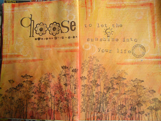
The following month it took me all of two seconds to come up with a colour I dislike almost as much as red. That would be orange then, very closely followed by yellow - haven't worked out what it's for other than when a circle of it appears in the sky from time to time.
 
Set me thinking...
 
 
Dylusions Ink Sprays in Lemon Zest, Pure Sunshine and a touch of Sqeezed Orange with Scattered Straw & Mustard Seed Distress Inks, topped with Wild Honey Distress Paint scraped on thinly and it was certainly orange, extremely orange. I added some of last month's red Distress Inks to try and warm it up (I am becoming my Mother!) then consoled myself the beautiful Donna Downey stamps from Unity, I had finally treated myself to would hide most of the sins.
 
I then covered everything with a couple of thin coats of Gesso to create a sort of sunray effect and to try and calm things down, then stamped Hero Arts new Stamp your Story stamps in Archival Ink in Saffron, Distress Ink in Ripe Persimmon and Picket Fence Distress Paint. I then added the flowers and words with stamps from PSX (there's a blast from the past!) and MM in my favourite Versafine Onyx Black ink.
 
I like this page marginally better than the red one but am so grateful I told myself I need only use each colour once in my journal, what a relief!
 
Thanks for persevering with my inky exploits.
Back soon xx
 

Thursday, 20 June 2013

Experiments with Distress Paints Part 2

Hello, back again as promised with a different technique with the scrummy new Distress Paints from Ranger.

Here's what I used on each sample ......

 
.....Distress Paints in Bundled Sage, Victorian Velvet, Antique Linen, Weathered Wood & Broken China, Treasure Gold in White Fire and a credit card style hotel room key.
 
I have just started (another) journal, this time a smaller A5 size so I can take it on holiday - no immediate plans but a girl can dream can't she! It has thinner paper than either of my current A4 journals so I was a bit worried about paint seeping through from one page to the next so I thought I'd try scraping the paint onto the page really thinly (with the hotel room card of course) to avoid this and two things happened.....
 
 
Firstly, the paint dried almost instantly and one of the features of DP is that once it's dry it is permanent, and secondly, the paint was so transluscent you could clearly see all the colours I used in the layers underneath. Oh my I liked that and found it was true on the texture paste bits through a Prima stencil too..
 
 
...and here's the finished journal pages
 
 
...with stamps from JOFY's Spring Collection from PaperArtsy stamped in Tsukineko's Versafine in Onyx Black and some detail picked out with an Inkessential's White Pen.
 
It set me thinking about what would happen if I added the paint slightly more thickly...
 
 
.....still transluscent but slightly less so.
 
 
I finished with texture paste again through a stencil from Prima, stamped with a fabulous image from Chocolate Baroque's new Punky Flowers plate and WOW's Platinum Detail Embossing Powder with a touch of Treasure Gold. Nice effect.
 
Finally my 'what if's' led me to applying the paint more thickly still but then it didn't dry so quickly and....
 
 
...I loved this effect.
 
Still some transparent bits showing off the layers below, but solidly opaque in other areas with the wetter layers scraped back off in parts so texture colour and layers. Heaven. I finished off with the same stamp, stencil etc as the earlier experiment and turned it into a really clean & simple card.
 
So, I learned Distress Paints .......
 
don't have to be grungy - you can keep all the layers pastel,
don't have to be opaque - you can scrape it on thinly and have transluscent layers,
don't have to be used with water - not a drop used here,
don't have to be applied with a brush - just add the paint directly to an old plastic card,
don't have to be dried between layers - semi dry doesn't mix to create mud and does give texture! 
 
That's all for now, be back Saturday with Part 3 of my Distress Paint Experiments - so many products to play with research, so little time.
 
Thanks for looking, hope you enjoyed xx 


Tuesday, 18 June 2013

Experiments with Distress Paints Part 1

Firstly, apologies for being MIA for way too long but sometimes life just gets in the way - I'm sure it's the same for everyone at some point.

A few weeks back I was having a little play carrying out important research for Snazzys with some new products which had found their way to my desk and I thought I'd share the results here ....

 
This is simply a 7" x 5" canvas board which I covered with Ranger's Antique Linen Distress Paint and whilst that was still wet, added DP in Walnut Stain, Broken China and more Antique Linen, one at a time at the top of the board, spritzed with water and allowed to run, drying between layers.
 
I then added some texture paste through a Prima Crackle Stencil, dried it, and with the stencil replaced, inked with Broken China Distress Ink at the top and Walnut Stain at the bottom. background complete in less than 10 minutes - result! 
 
The stamps are from Dylusions Monster Mash and I made a cover for the bell jar from Studio 490 Clearly for Art, heated and curved around a coffee cup to add dimension. The eyeballs were triple layer embossed in the centre using a Versamark Pen as was the monster's tongue, again to add a bit of dimension and contrast. The quote is also from Dylusions, this time the Christmas Words plate - you just never know when your Christmas stamps will come in handy lol!
 
Now, I had intended to stamp the tree from Dylusions other new release, Mischevious Malcolm to hang the bell jar of escaping eyeballs from but, having stuck the monster down with good old Cosmic Shimmer Acrylic Glue (therefore never to be unstuck), I hadn't left enough space. Change of plan and a few copper jump rings and matching chain had to do.
 
I so wanted not to like these paints but they are fantastic and allow you to create background effects, very simply, in a way which would not be possible with other acrylic paints I have used. Addicted then lol!
 
I will be back on Thursday with Part 2 of my Experiments with Distress Paint and Part 3 will follow on Saturday.
 
Thanks for looking xx


Saturday, 23 March 2013

Experiments in colour......

Hello there.
 
Those of you who know me well will recognise my addictions below - stamps (of course), black ink (preferably Tsukineko's Versafine in Onyx Black), backgrounds, 'nothing' stamps (not stamps of nothing that would be really silly, but stamps that are not of something in particular therefore versatile), really nice smooth white paper (ideal for stamping on), really fine detailed stamps, layers, alphabet/word stamps, very little colour and certainly no strong colours - other than black & white. 
You're getting the theme now lol!  
 
 
Even when I journal or scrapbook I find myself needing stamps, can't doodle, never hand write, never draw - can't, it's why I stamp, never use strong colours - other than black & white!
 
 The page above is very typical of the sort of journal page I enjoy creating, even though it does include some of my very messy handwriting.
 
Now, nothing wrong with creating things just because you enjoy the process, it's called a hobby! It's started me thinking though about why I find myself in the same groove. I have very little time to create so it's easy to reach for the 'go to' products because I know they will work for me, I will relax and be mostly pleased with what I make = good use of scarce time.
But is it the best use of my time?
 
Which brings me to........
 
 
my newest journal which I have decided will be all about my experiments in colour. I am going to make a real effort to use colour, especially those shades I am not so keen on, and hopefully learn something about the best use of my time along the way. Results to follow.....
 
What are your 'go to' products? what would you experiment with?
 
Do tell xx


Thursday, 28 February 2013

Hearty Greetings

Hello there.

It's been a long time, but then it is rather a long time since I made anything just because I fancied making it.

This little heart was just a quick Valentinesy piece which started as an experiment to see what happens if you use Ranger's Distress Crackle Paint in Picket Fence on white Sticky Back Canvas.

 
Well, it gave me a very fine crazed, rather than crackled effect, which I loved but it was very subtle, possibly magnifying glass territory lol! So I added a spritz of Dylusions Vibrant Turquoise ink spray, which leeched beautifully into every little crackle, and then added my Stampotique Falling Hearts stamp in Versafine Deep Lagoon.
 
I really liked my canvas heart so had to make a little something to add it to. So, one Wendy Vecchi Art Parts heart and word, smothered in Lake acrylic paint from Eco Green Crafts with some of their Artists Spackle through a Dylusions Harlequin stencil, plus Viva's Inca Gold in silver to highlight the texture. But, still lacking something, I swiped a corrugated metal set of wings with the Lake paint, on a baby wipe as I had alrady washed my brush, some more silver highlights and I was done.


Not a bad little project for less thn 45 minutes play.
 
Back soon xx
 
PS I added the little heart brad to balance the word 'Love' as it could only go just there after I discovered that if you put your finger on the crackle paint before it is dry it just lifts straight off.
You have been warned lol!! 


Wednesday, 2 January 2013

So Let's Try That Again.....


Happy New Year and here's hoping for everything you would wish for comes your way in 2013.
 
This time last year I made myself a Mini Resolutions Journal with just six resolutions.......
 
Make More Art
Take Part in Kate Crane's Monthly Calendar in my journal
Make some projects just because I want to rather than because I need a workshop project
Blog every week
Make one layout each month 
Take part, at least once a month, in Julia Budd's WOYWW
 
.....and because I know me so well, a seventh...... KEEP IT UP! 
 
 
Well, no prizes for guessing how that went but, I have awarded myself a 'must try harder sticker', and here's how this year's Resolution's journal looks..... 
 
 
If at first you don't succeed and so on lol!
 
Anyway, today I made one more project than I made yesterday, and it was just because I wanted to.... .
 
but now it's done I think I might use it for a workshop at Snazzys too.
 
Maybe there's a lesson to be learned there!
 
Thanks for stopping by xx